Visual Branding Strategy: A 2026 Guide for Marketers
- Vain.

- Jul 7
- 8 min read

Visual branding is the strategic use of logos, colors, typography, and imagery to represent a brand consistently across every touchpoint. It is the visual layer of brand identity design, translating abstract values into signals that audiences recognize and trust. Color alone increases brand recognition by up to 80%, which tells you how much weight a single design decision carries. A visual identity system is not a collection of isolated graphics. It is a coordinated design system where every element works together to communicate who you are. When that system is built with intention, it protects your reputation, builds trust, and reduces costly content rework across every department.
What are the essential elements of visual branding?
A visual identity system includes logos, typography, colors, imagery, and iconography that translate brand values into sensory signals. Each element carries meaning on its own, but the real power comes from how they work together.
Logo system. Your logo is not a single file. A complete logo system includes primary, secondary, and icon variants for different contexts. A horizontal lockup works on a website header. A stacked version works on a product label. An icon works as a social media avatar. Without these variants, teams improvise, and consistency breaks down.
Color strategy. Color is the fastest visual cue for brand identification. Your color choices influence perception before a single word is read. A defined color palette includes primary brand colors, secondary accent colors, and specific usage rules for digital and print.
Typography system. Type choices communicate personality as clearly as words do. A typography system defines a primary typeface for headlines, a secondary typeface for body copy, and rules for sizing, weight, and spacing. Consistency in type signals professionalism and builds familiarity over time.

Imagery and iconography. Photography style, illustration approach, and icon design all contribute to how your brand feels. A brand that uses warm, candid photography reads very differently from one that uses clean, minimal product shots. Defining this style prevents a patchwork of conflicting visuals across your channels.
Element | Role | Key Decision |
Logo system | Primary identifier across all contexts | Define primary, secondary, and icon variants |
Color palette | Triggers recognition and emotional response | Set primary, secondary, and usage rules |
Typography | Communicates personality and hierarchy | Choose typefaces and define size and weight rules |
Imagery style | Sets emotional tone and visual feel | Define photography and illustration guidelines |
Iconography | Supports navigation and visual communication | Align icon style with overall brand aesthetic |
Documenting all of these elements in a brand guide is non-negotiable. A brand guide is the manual on how to use the visual identity. Without it, every new hire, agency partner, or vendor makes their own interpretation of your brand.
How do you develop a visual branding strategy?
Visual branding must align with business strategy to prevent sending mixed messages to your audience. Before any design work begins, you need clarity on what your brand stands for and who it serves. Skipping this step is the most common reason visual identities feel generic or disconnected from the business they represent.
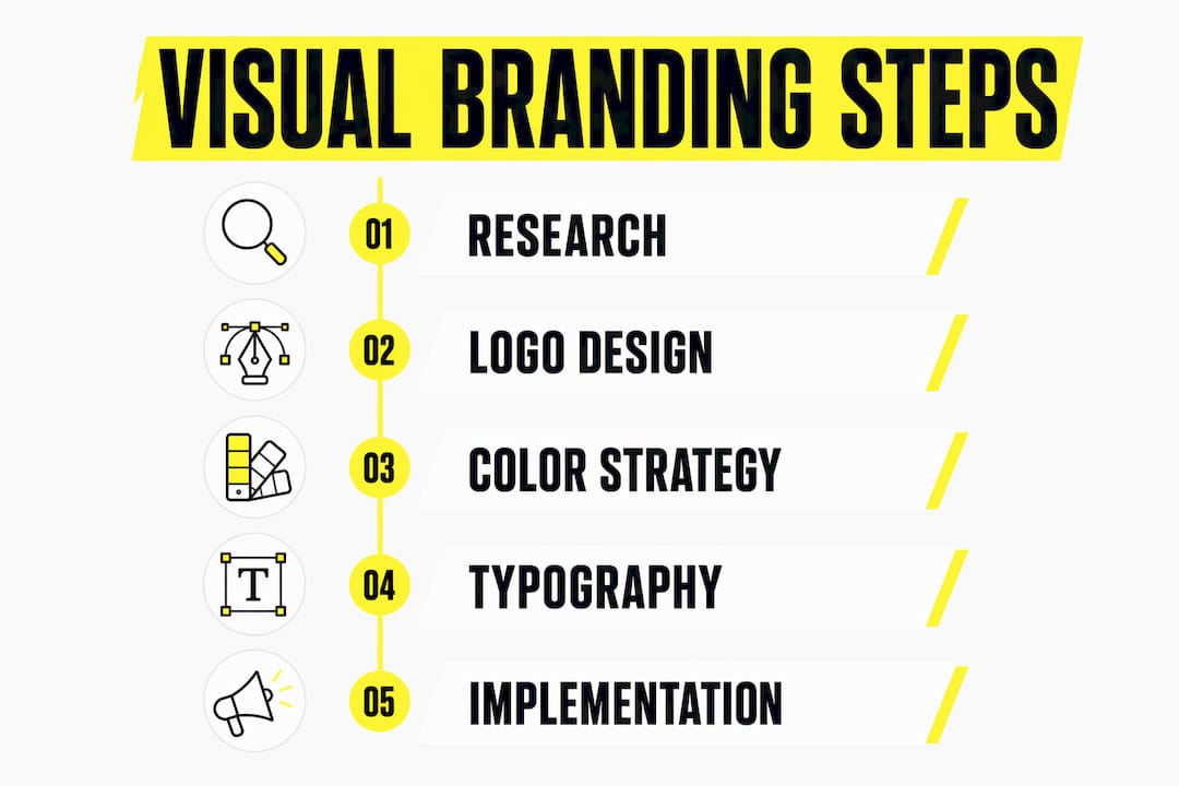
A practical approach to building a visual brand strategy follows three phases.
Research and audit. Analyze your current visual assets, your audience’s expectations, and the visual conventions of your category. Identify what signals trust in your space and where your current identity falls short. This phase prevents you from designing in a vacuum.
Define the foundation. Articulate your brand’s core values, personality, and positioning in writing before touching design tools. These written decisions become the brief that guides every visual choice. A brand that stands for precision and craft should look different from one that stands for warmth and accessibility.
Iterative design and testing. Build your visual system in stages. Start with the logo and color palette, then expand to typography and imagery. Test each element in real contexts, such as a social post, a product label, or a presentation deck, before finalizing. Real-world testing reveals problems that mood boards never show.
Modular brand identity systems allow flexible adaptations for sub-brands and new channels without breaking consistency. This matters most for growing businesses that will launch new product lines or enter new markets. A modular system gives you a shared visual grammar that new extensions can speak without starting from scratch.
Pro Tip: Avoid the most common mistake in visual branding: prioritizing style over strategy. A visually striking identity that does not reflect your brand’s actual values will confuse your audience and erode trust over time.
How do you maintain visual branding across channels and over time?
Most visual branding failures stem from “system decay,” which is the inconsistent application of logos and colors over time. This happens gradually. One team uses an old logo version. Another creates an off-brand social graphic. A vendor applies the wrong shade of blue. Over months, the brand fragments.
Preventing system decay requires treating your brand guide as an operational field manual, not a PDF that lives in a shared drive. Here is how to build that operational layer.
Lock templates. Convert your brand guidelines into locked templates for every recurring content format. Social graphics, presentation decks, email headers, and ad creative should all have approved templates that limit unauthorized changes. Locked templates and controlled assets maintain brand integrity at scale.
Centralize asset management. Store all approved logos, color files, and imagery in a single, accessible digital asset management system. When teams can find the right file in seconds, they stop improvising with whatever is on their desktop.
Implement design tokens for digital products. Design systems for digital products encode brand visuals as tokens and components, ensuring accurate implementation across web and app interfaces. A color token named “brand-primary” updates everywhere the moment you change its value. This eliminates the manual work of hunting down every instance of a color in a codebase.
Conduct regular visual audits. Enterprise brands should conduct quarterly visual identity audits and refresh core systems every 5–10 years. A quarterly audit catches drift before it becomes a full rebrand. A full refresh every 5–10 years keeps the identity current without abandoning the equity you have built.
Train your team continuously. Brand consistency is a people problem as much as a design problem. New team members need onboarding on brand standards. Existing team members need reminders when guidelines update.
Pro Tip: Treat visual branding as an ongoing operational process, not a one-time project. Brands that build branding tasks into weekly and monthly workflows maintain consistency far better than those that revisit brand standards only when something goes wrong.
What are the most common visual branding pitfalls?
Strong visual branding protects reputation, builds trust, and reduces content rework across departments. The inverse is equally true. Weak or inconsistent branding signals disorganization and erodes confidence in your product or service.
The most damaging mistakes share a common root: treating visual branding as decoration rather than communication.
Inconsistent application. Using different logo versions, color shades, or type styles across channels creates a fragmented identity. Audiences notice the inconsistency even when they cannot name it. It reads as carelessness.
Ignoring business strategy alignment. Visual decisions must be rooted in brand mission and values. A playful, colorful identity for a financial services firm sends the wrong signal. The visual system must match what the business actually does and who it serves.
Confusing brand guidelines with design systems. A brand guide defines the “what.” A design system defines the “how” for digital implementation. Growing companies need both. Relying only on a PDF brand guide leaves developers without the technical specs they need to implement the brand accurately.
Designing for today’s channels only. A visual system built exclusively for Instagram will struggle when the brand expands to packaging, events, or video. Build for flexibility from the start by defining how your system adapts across formats.
Neglecting accessibility. Color contrast ratios, readable type sizes, and alt text for imagery are not optional. Accessible design reaches more people and signals that your brand respects its audience. Semantic tagging and metadata also help AI systems and search engines recognize and categorize your visual content accurately.
Emerging trends in visual branding, including motion identity systems, AI-generated asset variations, and dynamic color systems, are expanding what a visual identity can do. The brands that will benefit most are those with a solid, well-documented foundation that can absorb new formats without losing coherence.
Key takeaways
Consistent visual branding requires a documented system, operational workflows, and regular audits to prevent identity drift and build lasting audience trust.
Point | Details |
Color drives recognition | Color increases brand recognition by up to 80%, making it your most powerful visual tool. |
Document everything | A brand guide is the operational manual that prevents every team from interpreting the brand differently. |
Build for flexibility | Modular identity systems let you expand to new channels and sub-brands without breaking consistency. |
Prevent system decay | Locked templates, centralized assets, and design tokens stop inconsistency before it spreads. |
Audit regularly | Quarterly visual audits and a full refresh every 5–10 years keep your identity current and coherent. |
Why I think most brands underinvest in the maintenance side of visual branding
The work that gets celebrated is the launch. The rebrand reveal. The new logo. The brand film. What rarely gets celebrated is the unglamorous work of keeping a brand consistent six months after the launch, when the excitement has faded and teams are moving fast.
In my experience, the brands that maintain the strongest visual identities are the ones that treat their brand guide as a living document, not a finished artifact. They update it when they add a new channel. They run quarterly audits. They train new hires on brand standards the same way they train them on any other operational process.
The strategic alignment piece is where I see medium-sized businesses struggle most. They invest in beautiful design, then undermine it by letting individual teams make visual decisions without a brief or a framework. The result is a brand that looks polished in the hero image and chaotic everywhere else.
My honest recommendation: before you spend another dollar on design, audit what you already have. Map every place your brand appears. Identify where it drifts. Then build the operational infrastructure, the templates, the asset library, the typography and design standards, to hold it together. Great visual branding is not a creative achievement. It is a discipline.
— Neville
How Vainnewyork brings visual branding to life
Vainnewyork is a creative consultancy and production company built for brands that take their visual identity seriously. We work with marketing professionals and business owners to develop brand identity systems that hold together across every channel, from digital content to physical merchandise.
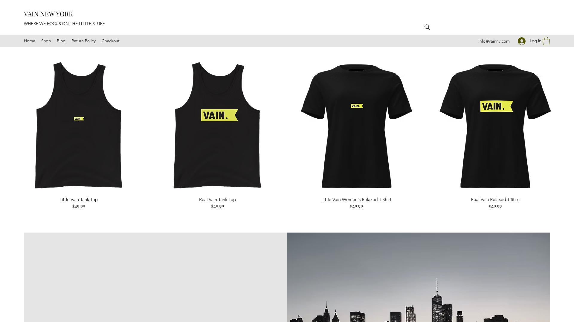
One of the most underused tools in visual branding is branded merchandise. Physical products carry your identity into the real world in a way that a social post cannot. The Vainnewyork shop offers brand-aligned apparel and accessories that help you extend your visual identity beyond the screen. Whether you are building a brand activation, rewarding your team, or creating touchpoints that reinforce your identity, graphic design merchandise is a channel worth taking seriously.
FAQ
What is visual branding?
Visual branding is the strategic use of logos, colors, typography, and imagery to represent a brand consistently across all touchpoints. It translates a brand’s values and personality into visual signals that audiences recognize and trust.
Why does color matter so much in brand identity design?
Color increases brand recognition by up to 80% and is the fastest visual cue for brand identification. It triggers emotional responses before any other element of the design is processed.
How often should you update your visual identity?
Industry standards recommend quarterly visual audits to catch inconsistencies early, with a full core system refresh every 5–10 years to keep the identity current without abandoning built-up brand equity.
What is the difference between a brand guide and a design system?
A brand guide defines the visual elements and rules for using them. A design system encodes those elements as technical components and tokens for digital product implementation. Growing businesses need both.
What causes visual branding to break down over time?
System decay, the gradual inconsistent application of logos, colors, and type across teams and channels, is the leading cause. Locked templates, centralized asset management, and regular audits are the most effective defenses.
Recommended
Comments