Types of Logo Placement Apparel: A 2026 Brand Guide


Types of logo placement apparel refer to the strategic zones on garments where logos are printed or embroidered to maximize brand impact and consumer appeal. The industry recognizes seven primary placement zones: left chest, center chest, full front, upper back, full back, back collar, and sleeves. Each zone carries its own sizing standards, production constraints, and visual weight. Choosing the right zone is not a stylistic afterthought. It is one of the most direct decisions a fashion brand or marketer makes about how their identity shows up in the world. At Vainnewyork, we see placement as the first act of brand storytelling on fabric.
1. Types of logo placement apparel: the seven core zones
The seven standard placement zones form the foundation of every apparel branding decision. Understanding each zone’s characteristics before committing to production saves time, money, and creative energy.
The seven primary zones are:
Left chest: Classic and professional, sized 3–4 inches wide, placed 3–4 inches below the collar or shoulder seam
Center chest: High visibility, 6–12 inches wide, positioned 2–4 inches below the collar seam
Full front: Maximum coverage, approximately 10–12 inches wide and tall, centered on the front panel
Full back: Large and commanding, 10–14 inches wide, centered 6–8 inches below the collar
Sleeve: Accent placement, 2–4 inches wide, set 1–2 inches below the shoulder seam
Back collar: Small, subtle, and often used for secondary brand marks or care labels
Upper back: A mid-size zone between the collar and shoulder blades, popular for team and event apparel
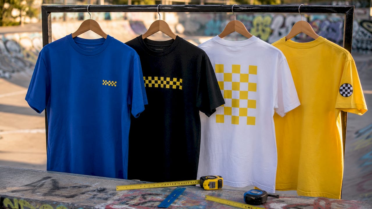
Each zone communicates a different brand energy. Left chest reads as corporate and trustworthy. Full front reads as bold and expressive. Sleeve reads as detail-oriented and fashion-forward.
Pro Tip: When building a new apparel line, prototype at least three placement zones before committing to production. What looks right in a mockup sometimes reads differently on a physical garment.
2. How placement zones align with branding goals
Logo placement should match intent: professionalism, visibility, streetwear style, and sports identity each call for different zones. Matching the zone to the goal is what separates a well-branded garment from a generic one.
Left chest placement is the default for corporate uniforms, polo shirts, and professional workwear. It signals authority without overwhelming the garment. Center chest and full back placements work best for event merchandise, retail drops, and any context where the garment itself is the marketing vehicle. Sleeve logos suit streetwear, secondary branding on jackets, and limited-edition collections where the detail rewards close attention.
“The placement zone you choose tells the viewer what kind of brand you are before they read a single word.” — Vainnewyork creative team
Garment type also shapes the decision. Hoodies favor center chest or full back because the kangaroo pocket disrupts left chest reads. Oversized tees amplify full-front graphics because the extra fabric creates a larger canvas. Structured jackets and blazers almost always call for left chest embroidery because the fabric weight supports it and the context demands restraint.
Combining two placements is a proven strategy for multi-zone branding impact. The most common combinations are left chest plus back, left chest plus sleeve, and full front plus back. Each combination creates a layered brand presence that works from every angle.
3. Left chest placement: the professional standard
The left chest is the most versatile and widely used placement in apparel branding. It is the default zone for uniforms, corporate wear, and any context where the brand needs to feel established and credible.
The sizing standard of 3–4 inches wide keeps the logo readable without dominating the garment. This range also aligns with embroidery hoop constraints. Embroidery shops cap left chest logos at approximately 4.5 inches wide to fit standard hoops, making it the lowest-risk zone for embroidered production. Brands that push beyond this limit often encounter distortion, puckering, or hoop marks on the finished garment.
Left chest placement pairs naturally with brand identity merchandise strategies because it reads as intentional and refined. It works across polo shirts, button-downs, fleece jackets, and structured caps. For fashion brands building a professional line, left chest is the anchor placement that everything else builds around.
4. Center chest and full front: maximum visibility
Center chest and full front placements are the loudest zones on any garment. They command attention and work best when the logo or graphic is designed to carry visual weight on its own.
Center chest logos sit 2–4 inches below the collar seam and span 6–12 inches across. This range gives designers flexibility to scale the mark to the garment size. A 6-inch logo on a youth tee reads the same as a 10-inch logo on an adult XL when both are proportioned correctly. Full front placement extends this logic further, filling the entire front panel with a graphic that functions more like a poster than a logo.
Full front works exceptionally well for event merchandise, band tees, and limited-edition retail drops where the garment is a collectible. The print method matters here. Screen printing handles large surface areas with consistent color and opacity. Direct-to-garment printing allows for photographic detail but can show variation across large runs. Brands should confirm their printer’s maximum print area before finalizing artwork at this scale.
5. Full back placement: high-impact rear branding
Full back placement gives brands the largest single canvas on any garment. At 10–14 inches wide and centered 6–8 inches below the collar, it is the dominant visual when someone walks away from you.
This zone is standard for team uniforms, event staff shirts, and retail merchandise where the brand needs to be visible in a crowd. Sports brands use full back for player names and numbers. Streetwear brands use it for oversized graphic statements. Corporate event teams use it for sponsor logos and event names that need to read from a distance.
The full back zone also pairs well with a smaller left chest logo for a front-and-back branding approach. This combination is one of the most requested in custom apparel production because it covers both face-to-face and walking-away moments. Understanding why custom apparel differentiates brands comes down to exactly this kind of intentional, multi-angle thinking.
6. Sleeve placement: the accent zone
Sleeve logos are small by design. At 2–4 inches wide and placed 1–2 inches below the shoulder seam, they function as accent marks rather than primary brand statements. Their power is in the detail.
Streetwear brands use sleeve logos to signal craftsmanship and attention to design. A small woven patch or embroidered mark on the left sleeve of a bomber jacket communicates that the brand thinks about every surface. Secondary logos, collab marks, and seasonal badges all work well in this zone. Sleeve placement also avoids the visual competition that happens when two large logos appear on the same garment.
Screen printing on sleeves requires careful registration because the curved surface can cause ink to shift. Embroidery on sleeves is more stable but requires a backing material to prevent fabric pull. Brands working with knit or stretch fabrics should test sleeve placement on a sample before committing to a full run.
7. Back collar and upper back: subtle and secondary
Back collar placement is the quietest zone on any garment. It typically holds a small secondary mark, a brand URL, a care instruction graphic, or a collab tag. The size is usually under 2 inches wide, and the placement sits just below the collar seam at center back.
Upper back placement occupies the space between the collar and the shoulder blades. It reads as a mid-size zone, typically 4–8 inches wide, and works well for team names, event titles, or secondary graphics that support the full back design. Many athletic and outdoor brands use upper back for a brand name while reserving the full back for a graphic or number.
Both zones reward brands that think about the garment as a complete object rather than a single front-facing surface. Apparel mockup tools make it easy to visualize all zones simultaneously before production begins.
8. Production guidelines for consistent logo placement
Precise placement instructions reduce logo drift and distortion during production. Vague terms like “center chest” or “upper left” create room for interpretation that leads to inconsistent results across a production run.
Follow these steps to specify placement accurately:
Name the zone. Use the standard zone name: left chest, center chest, full front, full back, sleeve, back collar, or upper back.
Anchor to a fixed landmark. Measure from the shoulder seam, collar seam, or placket rather than from the edge of the garment. Fixed garment landmarks account for size variation and improve repeatability across runs.
State the logo dimensions. Provide width and height in inches. Never assume the printer will scale to fit.
Note obstacles. Flag any seams, zippers, pockets, or buttons that fall within or near the placement zone.
Specify the method. Confirm whether the placement is for screen print, embroidery, direct-to-garment, or heat transfer. Each method has different size limits and fabric requirements.
Send a visual spec sheet. A flat sketch or mockup with measurements marked is the single most effective way to eliminate back-and-forth with vendors.
Pro Tip: For embroidery orders, always request a physical sew-out sample before approving a full production run. Digital mockups do not capture thread density, color variation, or fabric pull.
9. Placement zone comparison at a glance
Choosing between zones becomes clearer when you see them side by side. The table below maps each zone to its key characteristics and best use cases.
Placement zone | Typical size | Visibility | Best use case |
Left chest | 3–4 inches wide | Moderate, close-range | Corporate, uniform, professional wear |
Center chest | 6–12 inches wide | High, immediate | Retail merch, casual tees, event wear |
Full front | 10–12 inches wide and tall | Maximum | Graphic tees, limited editions, bold retail |
Full back | 10–14 inches wide | High, rear-facing | Team uniforms, event staff, streetwear |
Sleeve | 2–4 inches wide | Low, detail-level | Streetwear, secondary marks, collab badges |
Back collar | Under 2 inches wide | Minimal, intimate | Brand tags, URLs, secondary identity |
Upper back | 4–8 inches wide | Moderate, rear-facing | Team names, event titles, layered branding |
“The most effective apparel branding treats every zone as a deliberate choice, not a default.” — Vainnewyork creative team
Multi-zone combinations multiply the brand’s presence without requiring a larger logo. Left chest plus full back is the most balanced combination for professional and retail apparel. Full front plus sleeve works well for fashion-forward drops where the front graphic is the hero and the sleeve mark is the signature. Typography choices within each zone also affect how the placement reads at different distances.
Key takeaways
The most effective logo placement strategy pairs the right zone with the right garment type, brand goal, and production method to create consistent, high-impact apparel branding.
Point | Details |
Left chest is the professional default | Use it for corporate, uniform, and professional apparel at 3–4 inches wide. |
Size the logo to the zone | Center chest and full front range from 6–12 inches; full back spans 10–14 inches. |
Anchor measurements to fixed landmarks | Measure from shoulder seam or collar seam to reduce drift across production runs. |
Match placement to brand intent | Professionalism calls for left chest; visibility calls for full back or center chest. |
Combine zones for multi-angle impact | Left chest plus back and full front plus sleeve are the most effective pairings. |
Why placement is the most underrated branding decision
I have reviewed hundreds of apparel briefs over the years, and the single most common mistake I see is treating logo placement as a last step. Brands spend months perfecting a logo, then drop it wherever there is open space on the garment. The result is a beautiful mark in the wrong context, telling the wrong story.
The left chest placement is not just a convention. It is a visual contract with the viewer. When someone sees a logo there, they read it as professional, established, and intentional. When that same logo appears oversized across the full front of a hoodie, it reads as expressive and bold. Neither is wrong. But only one of them matches the brand’s actual positioning.
What I have found is that the brands with the most consistent apparel presence are the ones who specify placement before they finalize artwork. They build the logo to fit the zone, not the other way around. A mark designed for left chest embroidery at 3.5 inches wide is a different creative decision than a mark designed for full-back screen printing at 12 inches wide. The zone shapes the design.
My honest recommendation for 2026: test every placement in a physical sample before approving production. Mockup tools are useful for visualization, but fabric behaves differently than a screen. A sleeve logo that looks balanced in a digital flat can look cramped on an actual sleeve. The sample is the truth.
— Neville
Vainnewyork apparel: placement done with purpose
At Vainnewyork, every garment in our collection is designed with placement as a core creative decision, not an afterthought. We build each piece so the logo zone reinforces the brand story the garment is meant to tell.
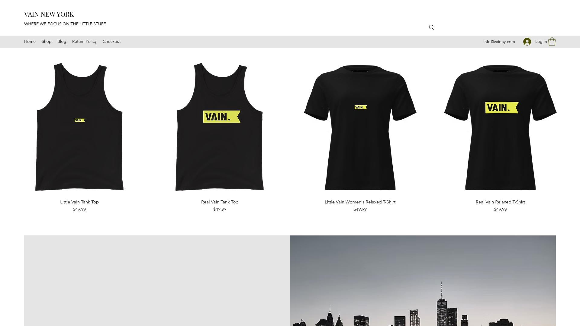
Whether you are looking for a refined left chest mark on a structured piece or a bold full-back graphic on a statement drop, our shop offers customizable apparel with expert support at every stage of the placement and production process. Our team works with fashion brands, marketers, and designers to translate branding goals into garments that hold their visual integrity from the first wear to the hundredth. Browse the collection and see how intentional placement shapes every piece we make.
FAQ
What is the most common logo placement on apparel?
The left chest is the most common and widely recognized logo placement on apparel. It is the default for professional, corporate, and uniform wear, typically sized at 3–4 inches wide.
How big should a logo be on the back of a shirt?
Full-back logos are typically 10–14 inches wide, centered 6–8 inches below the collar seam. This size ensures visibility from a distance without overwhelming the garment.
Can you put a logo in more than one place on a shirt?
Yes. Combining two placements is a standard branding practice. The most effective combinations are left chest plus back, left chest plus sleeve, and full front plus back.
What placement works best for embroidery?
Left chest is the standard embroidery zone because it fits within standard hoop sizes, with a practical width limit of approximately 4.5 inches. Larger placements like full front are better suited to screen printing or direct-to-garment methods.
How do I specify logo placement to avoid production errors?
Use fixed garment landmarks like the shoulder seam or collar seam as your measurement anchor points. Provide zone name, dimensions in inches, and a visual spec sheet to eliminate ambiguity with your printer or embroiderer.
Recommended
Comments